| Announcements | Syllabus | Schedule | Weekly lecture notes | Links |
Let's take an example of the masses of pebbles on a beach. If you pick up a pebble on the beach, it is a specimen. It might not be representative of all the pebbles on the beach (population). But we cannot examine all of the pebbles on the beach, so
we select a subset (10 or 100 or 1000, etc.) and that is a sample (dataset) of the population which we hope is representative. Here we will play with a small data set of pebbles. Open this web page in a browser:
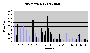
Below I show a plot of the masses of the individual pebbles in our sample: (a default Excel plot). This chart was made with the Chart Wizard, choosing columns and adding labels, and gives a visual impression of the data, but can we do more? Of course!
The simplest way to look at a dataset is just to sort it. In Excel, look at Data->Sort. You can sort on multiple columns (size, then shape, etc. if they are in your spreadsheet). One really important point is that you should be aware that sorting with only one column will scramble your data. So, you should probably select all of the columns and then in the sort dialogue, choose the column(s) on which you want to sort.
In today's lecture we are continuing our introduction to Microsoft's Excel. We will cover some basic statistics in Excel: histograms and frequency. If your data set is either huge or complicated looking, what is the best approach for analyzing it? Here are some options:
Obviously, we should pursue options 2 and 3. We can apply some statistical tools to Earth and Space science problems. We should be careful however, that a statistical description of our data does not bias our view of the data. So... What is a statistic? --> An (estimated) parameter that characterizes a dataset. Wikipedia.org states:
Statistics is a mathematical science pertaining to the collection, analysis, interpretation, and presentation of data. It is applicable to a wide variety of academic disciplines, from the physical and social sciences to the humanities; it is also used for making informed decisions in all areas of business and government.
Statistical methods can be used to summarize or describe a collection of data; this is called descriptive statistics. In addition, patterns in the data may be modeled in a way that accounts for randomness and uncertainty in the observations, to draw inferences about the process or population being studied; this is called inferential statistics. Both descriptive and inferential statistics can be considered part of applied statistics. There is also a discipline of mathematical statistics, which is concerned with the theoretical basis of the subject.
The word statistics is also the plural of statistic (singular), which refers to the result of applying a statistical algorithm to a set of data. Thus we speak of employment statistics, accident statistics, etc.
When we work with with a large number of observations, it is desirable to be able to describe some of the basic characteristics of the data with single numbers that describe some essential feature of the data, specifically the distribution of numbers. Some important examples are:
Here are some basic representations of the mass of the distribution that we'll quickly play with:
Mean = (sum of all values) divided by the number of values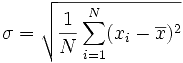
How can we improve on the pebbles chart and possibly display the
distribution of pebble masses graphically? The simplest method uses the
frequency histogram which allows the general properties of the distribution
to be visualized.
OLD EXCEL way: If you haven't already done it, install
the Analysis Tool Pack [choose Tools>Add Ins.., then check both
Analysis Tools Pack boxes], then go to the Tools/Data
Anaysis... dialog box, scroll down and choose Histogram.
Office 2007:
 , and then click Excel Options.
Tip �If Analysis ToolPak is not listed in the Add-Ins available box, click Browse to locate it.
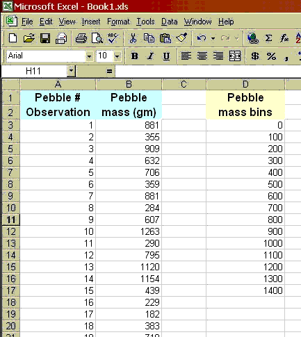
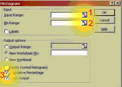
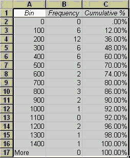
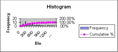
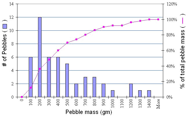
To construct such a plot, we need to decide on specified ranges of values (bins) within which we want to count the number of pebble masses (Frequency distribution). For example, you might bin masses from 0-100, 100-200, etc. Go ahead and make a column with values 0, 100, then drag the lower right box corner down, which will fill lower cells with that pattern; stop when an appropriate range has been created. Then when we plot the frequency distribution using a bar chart, we have a frequency histogram. Note we might also look at the cumulative frequency distribution in which we add the cumulative percentage of the total specimens that are in each bin. The curvature of the cumulative distribution plot tells us something about the dispersion of the dataset.
Here I will walk you through making this first histogram with a frequency curve, for the pebble data set. You very well may do this dozens of times this semester, so become familiar with these steps. For this example, I'm assuming you already have your pebbles data set correctly entered into a spreadsheet.
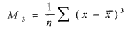
Note that the mean is not near the center of the data. These data have significant positive skewness. Positive skewness means that the tail of the distribution is longer to the right. Negative skewness is the opposite. In general, a bigger number means more asymmetry. (be careful that you know what the program is actually computing). Standard skewness is in units of the standard deviation, so if it is <1, then we are close to being symmetric. The skewness is based on the deviations cubed:
Some of the pebbles example comes from short course notes, Statistical inference for Geology and Planetary Geology, L. S. Glaze and S. M. Baloga, 1997; and also: Waltham, D., 1994, Mathematics: a simple tool for geologists, New York: Chapman and Hall, 189 p.
Web page originally by Prof. Ramón Arrowsmith with major modifications and additions from Prof. Ed Garnero and Prof. Steve Semken