| Announcements | Syllabus | Schedule | Weekly lecture notes | Assignments | Links |
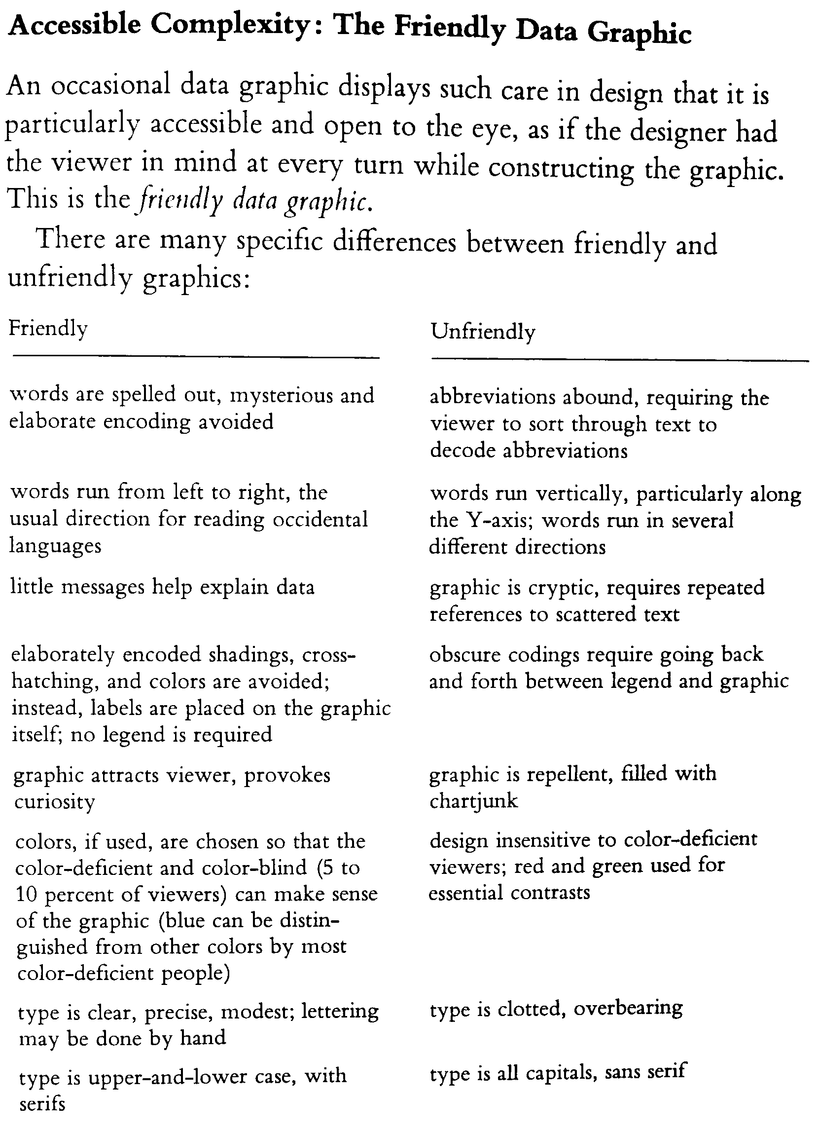
Visualizing geologic information is an essential step in developing understanding about the relationships between different data and model results. It is worth considering how your data or results are presented. This is what advertising all about. You must be aware of the effect of presentation on the viewer. The practice of visualization has many aspects. For today's lecture, I want to bring to your attention the work of Edward Tufte, a professor at Yale University who has written several books on the visual presentation of information.
Charts and graphs (both terms mean essentially the same thing) are data graphics: visual representations of measured quantities, ubiquitous in all fields of science, mathematics, engineering, and technology. Tufte briefly describes their nature, history, and uses in the introduction to his book The Visual Display of Quantitative Information (second edition, 2001):
"Data graphics visually display measured quantities by means of the combined use of points, lines, a coordinate system, numbers, symbols, words, shading, and color.
The use of abstract, non-representational pictures to show numbers is a surprisingly recent invention, perhaps because of the diversity of skills required-the visual-artistic, empirical-statistical, and mathematical. It was not until 1750-1800 that statistical graphics-length and area to show quantity, time-series, scatterplots, and multivariate displays-were invented, long after such triumphs of mathematical ingenuity as logarithms, Cartesian coordinates, the calculus, and the basics of probability theory.
Modern data graphics can do much more than simply substitute for small statistical tables. At their best, graphics, are instruments for reasoning about quantitative information. Often the most effective way to describe, explore, and summarize a set of numbers-even a very large set-is to look at pictures of those numbers. Furthermore, of all methods for analyzing and communicating statistical information, well-designed data graphics are usually the simplest and at the same time the most powerful."
Communicating and analyzing geoscientific data in data graphics are essential components of our science. You should be fully aware that the way in which information is presented-independent of the nature of the information itself-strongly influences how that information is perceived and understood. Advertisers and propagandists know this well, and so should we, not only as citizens and consumers, but as producers and users of geoscientific information. In creating data graphics, we must be wary of the tendency of form to hinder function, or style to supersede substance.--Steve Semken
Tufte has a lot to say about a lot of things. A recent example was his criticism of MS Powerpoint: The Cognitive Style of Powerpoint.
One of the concepts from Tufte that has influenced me greatly is the data/ink ratio. You want to have as much of the ink in your graphic dedicated to the most important data, rather than any design element for a plot or graphic. Always remember, when presenting quantitative information: "Show data variation, not design variation."
In this lecture, I will introduce you to a few ideas from Tufte and encourage you to consider them as you analyze and present your data.
Here is a really nice contemplation on Tufte: The Gospel According to Tufte by Professor John P. Boyd
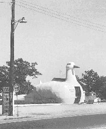
What is a duck? When a plot of your data becomes fuller of design elements than data, we will follow Tufte's nomenclature in calling your chart a "duck". This is for those special cases where a graphic is no longer what it is intended to be -- a vehicle for some data/info -- and is instead a piece of design that does not have to do with the original data. This term was inspired by the store whose appearance is that of a duck, and not a store.
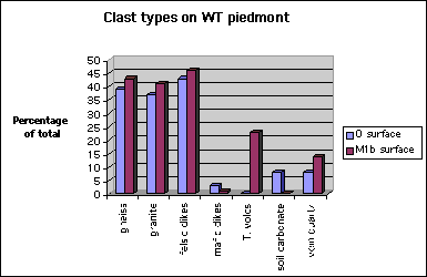
Let's look an one example of the data/ink ratio. Many charting programs try to help us by providing design tools that actually are not very helpful (I won't name any names). For example, below is a pie chart that shows the distribution of clast types in a Quaternary deposit in the western White Tank Mountains, Arizona:
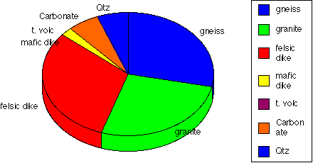
Note that the 3D effect looks kind of cool, but it is also distracting. What about this one:
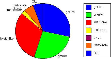
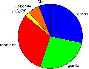
Note that the dual labeling of the categories on the explanation and the graphic itself are redundant. Same information, much less of a duck:
A way to measure how effectively we're spending our resources (e.g., ink) in making our graphic is with a ratio of ink used for data (points, lines, etc) to the total ink used in the graph. This is effectively the percentage of your plot that is devoted to the crucial information, and non-redundant info. We want this Data-ink ratio to be as close to 1 as possible.
Here is an example that follows Tufte's The Visual Display of Quantitative Information, pages 126-128 (Redesign of the Bar chart/histogram). In this example, the same dataset that we showed in the pie charts above is made into a bar chart with Excel:
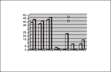
It looks impressive, doesn't it? Now what if we subtract from it a bunch of chart junk:
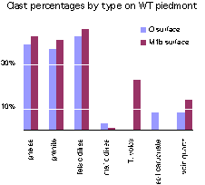
If we also clean the chart up a bit, we can get it to look like this:
For the rest of our course, we will focus on minimizing the chart duck effect on our scientific graphics.
Here is a whole set of commentary on Excel's chartjunky graphics from Tufte's web site.
Another important blunder you should avoid is one where you illustrate some kind of trend or dimension with a scale that is not accurate to the trend. Tufte defines this as the "Lie Factor". Specifically, the lie factor = the size of the effect shown in the graphic, divided by the size of the effect in the data.
Tufte uses a newspaper example to make this point:
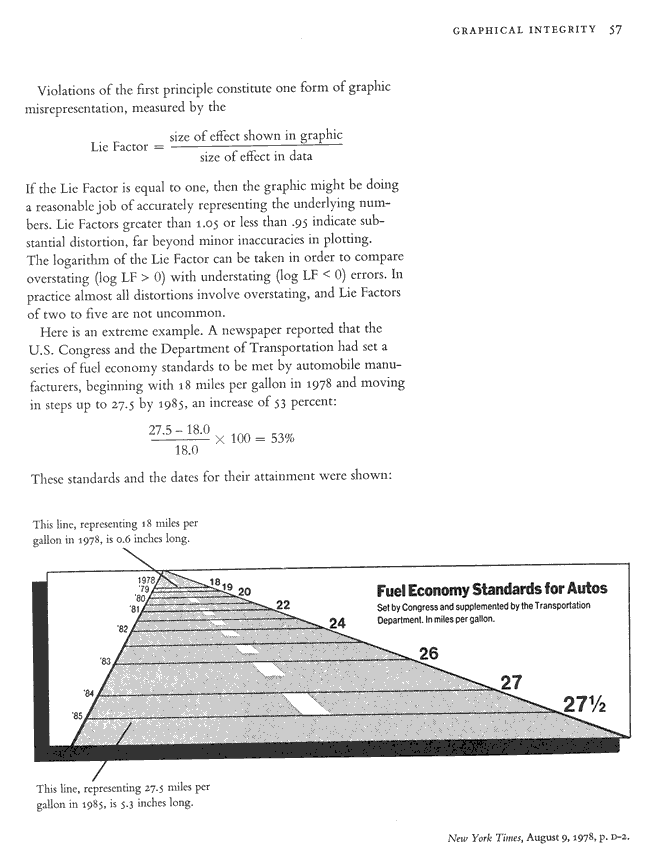
The size of the effect in the graphic is 5.3 inches - 0.6 inches over 0.6 inches = 780%. So the lie factor would be 780%/53%= 14.7!!!
This assignment is due by the beginning of class time, Monday, September 28 as a link on your web site page of assignments. If possible, include the images or links to them (if nothing else, take a picture with a smart phone).